Abstract
In the summer of 2010, in a much anticipated decision, NBA all-star Lebron James announced to the world that he would be taking his talents to South Beach to join the Miami Heat. This makes us question - is Miami, Florida really the best place for one to take their talents to? In this report, we analyze the World Happiness Report dataset to determine the top destinations around the world in terms of overall happiness. The happiness scores utilize data from the Gallup World Poll which collects answers in a Candril ladder survey format. Respondents are asked to think of a ladder with the best possible life for them being a 10, and the worst being a 0 and to rate their current lives on such scale. The dataset consists of over 150 countries from the years 2015 to 2020, consisting of features such as life expectancy, economic product, corruption and much more. While our travel decisions may not be as complicated as Lebron James’, we hope to analyze the dataset to effectively assess the past, current and future well-being of nations around the world.
Preprocessing
For each year’s dataframe, we will preprocess the data by determinig if there are any invalid entries. Specifically, any values of NaN or 0 (when not appropriate), will be treated by taking the mean of the remaining values in the column. We then concatenate all the dataframes to form a final version which includes all the years.
After processing the data, we observe that the values with zero/null can in fact be replaced by the mean of the remaining entries for the corresponding column. The only columns where this wouldn’t make sense is for Country and Happiness_Rank. We note that y2020 has no invalid entries.
We now mask all zero/null entries with the corresponding column mean.
We also observe a discrepancy in units used between the y2020 dataframe vs. the rest. Specifically, the GDP_per_capita and Healthy_life_expectancy are notably different magnitudes in y2020. Additionally, the range of values in certain columns of y2020 are much greater than the other years. For example, for Finland the corresponding values are:
GDP_per_capita: 10.64 (2020) vs. 1.34 (2019)Healthy_life_expectancy: 71.90 (2020) vs. 0.99 (2019)
We decide to address this issue by normalizing the data for all columns that do not belong to Country, Happiness_Score and Happiness_Rank.
We also note that normalizing the data for each year’s dataframe will re-introduce zero values. However, the interpretation is different from having invalid entries.
What affects a country’s happiness score?
We evaluate the signifance of each feature for the given dataframe to determine what factors affect a country’s happiness score. Additionally, we examine if any features are more correlated than others.
                            OLS Regression Results
==============================================================================
Dep. Variable:        Happiness_Score   R-squared:                       0.732
Model:                            OLS   Adj. R-squared:                  0.730
Method:                 Least Squares   F-statistic:                     506.5
Date:                Wed, 09 Dec 2020   Prob (F-statistic):          2.15e-262
Time:                        02:12:25   Log-Likelihood:                -821.36
No. Observations:                 935   AIC:                             1655.
Df Residuals:                     929   BIC:                             1684.
Df Model:                           5
Covariance Type:            nonrobust
=============================================================================================
                                coef    std err          t      P>|t|      [0.025      0.975]
---------------------------------------------------------------------------------------------
Intercept                     2.5266      0.067     37.677      0.000       2.395       2.658
GDP_per_capita                1.9729      0.146     13.493      0.000       1.686       2.260
Healthy_life_expectancy       1.6134      0.138     11.698      0.000       1.343       1.884
Freedom                       1.3565      0.098     13.840      0.000       1.164       1.549
Generosity                    0.3108      0.122      2.541      0.011       0.071       0.551
Perceptions_of_corruption    -0.0759      0.073     -1.039      0.299      -0.219       0.067
==============================================================================
Omnibus:                       29.084   Durbin-Watson:                   1.471
Prob(Omnibus):                  0.000   Jarque-Bera (JB):               30.984
Skew:                          -0.438   Prob(JB):                     1.87e-07
Kurtosis:                       3.170   Cond. No.                         15.1
==============================================================================
We observe at the 95% significance level that Perceptions_of_corruption is not deemed significant.
We notice that from the correlation heatmap that there exists a strong correlation between GDP_per_capita and Healthy_life_expectancy. This observation is expected as wealthier countries tend to have a better environment and infrastructure that supports healthy living. Some examples of this include better hospital facilities, access to better nutrition, and programs that promote an active lifestyle.
This indicates to us that we should take our talents to country’s that portray high levels of wealth, health, freedom or generosity.
Are countries in specific geographic regions happier?
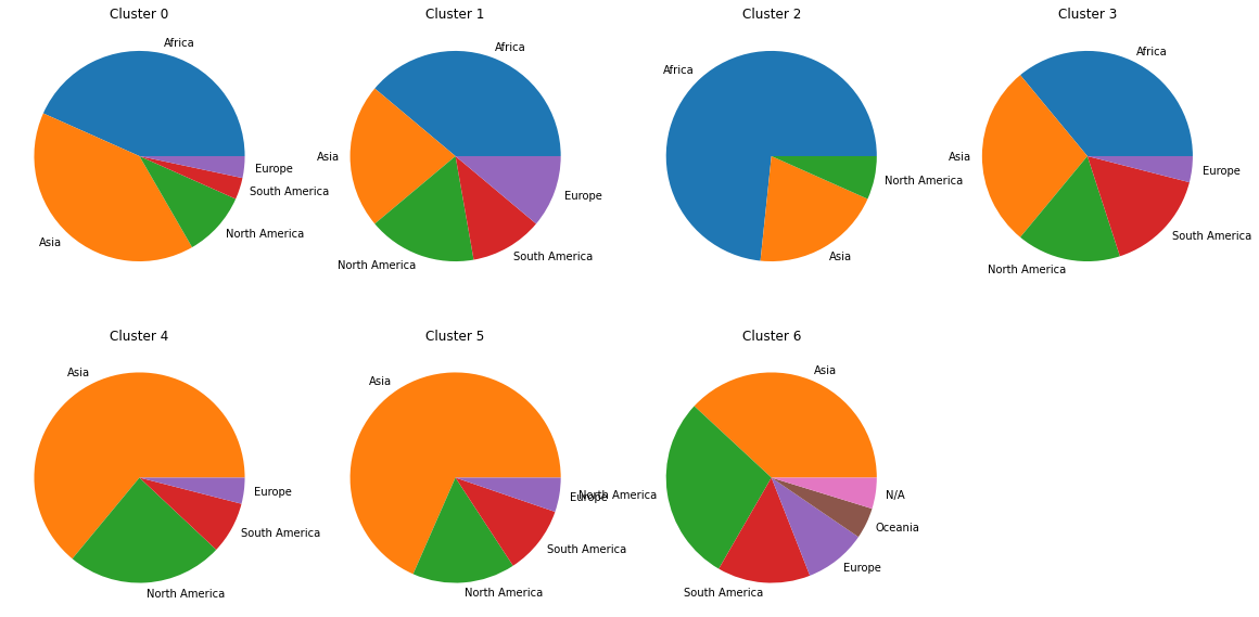
We now shift gears and try to analyze the impacts geographic location has on a country’s happiness score. Specifically, we evaluate the y2020 dataset to determine if neighbouring countries or countries belonging to the same continent are similar in their happiness score. We apply an unsupervised K-means clustering approach to label countries into corresponding continents. As such, we use a cluster size of 7 to resemble the number of continents around the world.
While one approach may be to consider all features in the dataset and then applying a dimensionality reduction method such as t-SNE or PCA, we decide to apply K-means on just the Happiness_Score. The analysis is thus performed in one dimension, in which the data points are plotted linearly.
We propose an unsupervised approach to learn geographic continents solely based on happiness scores from our dataset. From the above plots, we see that this approach performs fairly poorly in grouping countries based on this criteria. While we do see some countries that are more dominant in certain clusters (e.g. Europe within clusters 1, 5 and 6), there does not seem to be enough supporting evidence for such approach to work. As a result, we conclude that countries belonging to a specific continent do not necessarily share similar happiness scores.
As a result, we should be wary of moving to a specific country if nearby countries don’t share the same levels of happiness.
K-means for multiple variables
We repeat the process but this time we do it taking into account the two most important covariates for our model.
Then the clusters colored by continent:
We propose an unsupervised approach to learn geographic continents, but this time based on happiness scores as well as the GDP_per_capita and the Healthy life expectancy. From the above plots, we see that it perfoms better but even so, this method still remains a poor choice.
Trends in happiness
We now evaluate the trends in happiness levels over the years from 2015 to 2020. We calculate the mean happiness scores for all countries belonging in each year to see if there exists an evident trend over time. We also look at specific countries that are selected at random from one of the seven clusters defined previously. Recall that each cluster is supposed to represent a grouping of countries with similar happiness scores. As a result, the analysis will be able to display trends in happiness of countries spanning the whole range (from very unhappy to very happy).
The above plot reveals that the average happiness score for all countries experienced a very minimal increase over the years. There does not seem to be enough supporting evidence to explain this tiny increase, especially over such a short time period and after considering the error range.
However, there are notable trends that exist between individual countries. While only some countries were sampled from the whole, it is expected that such trends would exist on an individual case by case basis. As such the displayed plots are by no means representative of the countries not displayed from the same cluster.
Countries such as Brazil and Zimbabwe have been experiencing a sharp decline in happiness scores over the past five years. This may be as a result of numerous factors such as increased corruption, lack of government intervention or worsened social services. We notice that Brazil’s happiness score was more or less constant from 2015 to 2016. The decline it experienced afterwards may be attributed by hosting the 2016 Summer Olympics as it incurred significant debt and had to make drastic cuts in other areas of spending such as healthcare. This is contrast to the trend Estonia has experienced over the years.
Perhaps we should consider taking our talents to countries that are experiencing significant rises in happiness scores. It may be in our best interest to consider settling down and purchasing real estate while such countries are still under the radar.
Matching
With matching, what we intend is to carry out an analysis having two groups, one for treatment and the other for control, with similar characteristics. That is, they have a similar propensity score, and in this way make a much more rigorous study.
First, we are going to compare both groups in characteristics such as GDP, life expectancy, generosity, and so forth. Without doing any kind of matching, the comparisons between two countries may not be robust. That is why we then calculate the propensity score, and match samples from both groups based on the similarity of their propensity score, and from there we make the same comparison between both groups in different features.
We calculate the median of GPD per capita and then we create a dummy variable, indicating with 1 the countries that have a GPD greater than the median, and with 0 the countries with a GPD lower than the median.
Then, for each characteristic of the dataset, we compare the control group with the treatment group.
{comparative boxplots}
Propensity score model
Optimization terminated successfully.
         Current function value: 0.349780
         Iterations 8
                           Logit Regression Results
==============================================================================
Dep. Variable:              treatment   No. Observations:                  153
Model:                          Logit   Df Residuals:                      148
Method:                           MLE   Df Model:                            4
Date:                Mon, 07 Dec 2020   Pseudo R-squ.:                  0.4954
Time:                        20:42:08   Log-Likelihood:                -53.516
converged:                       True   LL-Null:                       -106.05
Covariance Type:            nonrobust   LLR p-value:                 8.209e-22
=============================================================================================
                                coef    std err          z      P>|z|      [0.025      0.975]
---------------------------------------------------------------------------------------------
Intercept                    -6.8382      1.952     -3.503      0.000     -10.665      -3.012
Healthy_life_expectancy      12.9627      2.319      5.589      0.000       8.417      17.508
Freedom                      -0.0803      0.297     -0.271      0.787      -0.662       0.501
Generosity                   -0.3715      0.290     -1.280      0.201      -0.940       0.197
Perceptions_of_corruption    -1.9052      1.557     -1.223      0.221      -4.958       1.147
=============================================================================================
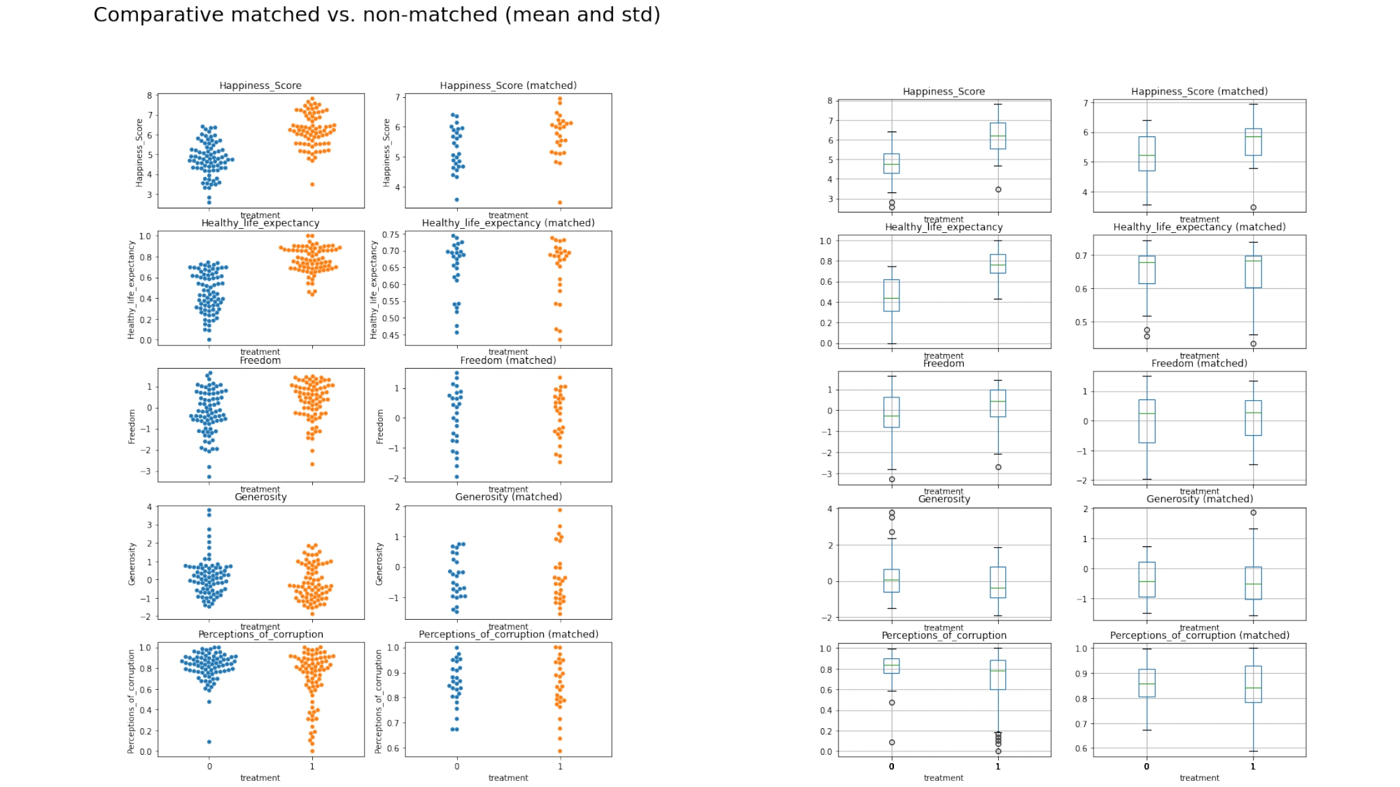
We can see a notable difference between the model with non-matched and the one with matched samples in the majority of values.
All the variables involved in the calculation of the propensity score are much more similar. Although the values have been equalized, we can say that the richest countries are also the happiest.
Now, let’s imagine that Lebron had to decide this Christmas where to play next year, or any of us had to choose a destination to work in the next few years. It is common to think that the first thing we would look at would be the impact of the coronavirus in that country. This is why the following reflection arose. How has the coronavirus affected people’s happiness?
How has the coronavirus impacted happiness?
To answer this question, we have used the data that we have available to date. With the current situation, marked by the presence of the coronavirus, we wanted to try to study the impact of the pandemic on the happiness of the countries. We have obtained the coronavirus data from scarpping the Worldometer webpage.
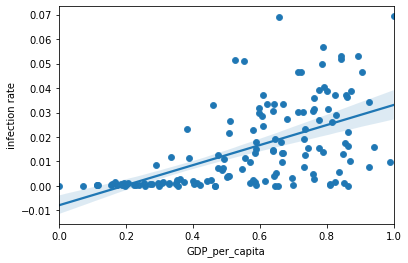
To study the impact of the coronavirus on happiness, we are going to study the relationship between the coronavirus and the two features that we have seen that have the greatest influence on happiness, GDP and life expectancy.
GDP vs. Infection rate
Life expectancy vs. Infection rate
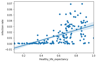
It is true that the number of cases detected is much higher in developed countries and this may be due to the fact that in developed countries there is more testing work. For this reason, we analyze the number of deaths instead, in order to obtain a better understanding of our data.
GDP vs. Deaths
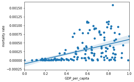
The death rate in this analysis confirms the observations we’ve seen previously in which developed countries experience higher COVID-19 cases than developing countries. This result may be biased as developed countries have the infrastructure to support more testing, thus revealing more positive cases. As a result, we used deaths caused by COVID and GDP per capita as the dependent and independent variables, respectively. The results of our study indicate that there exists a significant positive correlation between death rate and GDP per capita. As such, this confirms that developed countries are of higher risk of COVID related deaths than developing countries.
To view the results in a more intuitive, we show below the COVID infection rate cases per country around the world.
We see in the plot above, that maybe Lebron should reconsider taking his talents to Los Angeles this season. He may want to consider playing for the EPFL ADA team located in Lausanne, Switzerland instead!
Conclusions
Regardless of where one decides to take his or her talent, the most important thing is to be happy wherever one goes!